Part IThis is my most successful image because I feel that it really captures the differences in the time eras while also presenting similarities in photographic techniques. Rather than taking my image with he same composition as Henri Cartier-Bresson I chose to take my photo from a low perspective angle - this gives off the image of power and authority that the other image already contains. The subject of Bresson's work has an aura of power about him and the high-angle perspective is used to show the space below him and his authority over this space. Both of the photos use the rule of odds and the rule of thirds to dramatize the image, while the black and white presentation brings the focus of your eye immediately to the subjects of the photo - the powerful male. Both subjects are emphasized with side lighting shining on their backs, making their expressions lost among the shadows. Both photos also have a background that is lighter than the subject, making the subject stand out from its surroundings. These photos are both very interpretative, leaving the story of the subject to the digression of the viewer - the emotions of the subject are difficult to truly comprehend. he most challenging aspect of this assignments was choosing a photographer to emulate. I did some research on modern photographers and couldn't find what I was looking for before I started looking into black and white photographers from back in the day. I have always had a passion for black and white photography and the impressionable nature that these photos can hold, so when I found Henri Cartier-Bresson I fell in love with his images. All of his photos are based around people and have many ethically evaluative or interpretative qualities among them. Once I found Bresson's photos, it was easy to find the story and passion in my own. In the future, I will use the techniques I have learned in class with the techniques that I have learned from researching various photographers. There are so many photographers out there who all have a different perspective, and the more images I looked at, the more I learned the techniques that each artist used and how I can use them in my own work. One can learn a lot by appreciating the work of others Part IIhttps://morganabphotos.weebly.com/blog/emulating-a-professional-photographer This image is extremely successful for a variety of reasons. The techniques you used, although similar to Art Wolfe, were not completely identical. Wolfe took advantage of more muted background colors and angling while your photo was more vividly colored and symmetrical - both photos producing completely different emotion from your audiences. The bullseye composition of this photo produces a lack of movement in the subject but gives off symmetry that is very pleasing to the eye if that was the technique you were trying to exemplify. The use of complementary coloring for this photo, emphasizes the subject of the photo and makes the butterfly stand out from the rest of the image. This coloring immediately draws your eye to the orange color and brought me a sense of optimism and harmony - symbolic of the colors orange and green. The use of top light in this photo makes the colors of the image extremely vivid while giving the background shadowing and depth that is needed for this image to be successful. If you were to change anything about this photo, I would have angled the butterfly slightly in order to create some movement in the image - I think just this small change could dramatically impact your image and give it more emotion and depth. Rather than looking like a descriptive photograph, it could become more of an interpretive photo - trying to understand the butterfly and its journey rather than just looking at the subject itself. Overall, I think your image was successful and your use of these techniques was very well thought out and exemplified.
0 Comments
PaRT Ihttps://lexifying.weebly.com/blog/multimodal-presentation The language used throughout this presentation was clear and precise, giving off a professional tone. I could tell that you really studied Meyerowitz and his work, and you explained it all in a very informative way. The pictures you chose went well with the details you discussed and the explanations were very in depth so I learned a lot from listening to what you had to say. One thing that you could do differently in the next presentation is include other photos of Meyerowitz's work on top of the images you critiqued in order to share more of an array of his work with your audience. This could help your viewers get a better idea of the other kind of perspectives he worked to capture. However, I think that you did a great job at critiquing these photos and definitely understood the language you were using to describe the composition, lighting, color, mood, etc. Meyerowitz's work is a very simple take on reality but I could tell that it held a deep meaning. He seemed to find the beauty in the world around him and wanted to share it with others. I noticed he used many muted tones of color, which allows you to focus more on the subject and the meaning behind the photo. This photographer helped to realize that a simple picture can hold true emotion and can be used to show a different side of photography that we don't see often. Meyerowitz's realistic view of the world is what makes his photography stand out from others.
PART I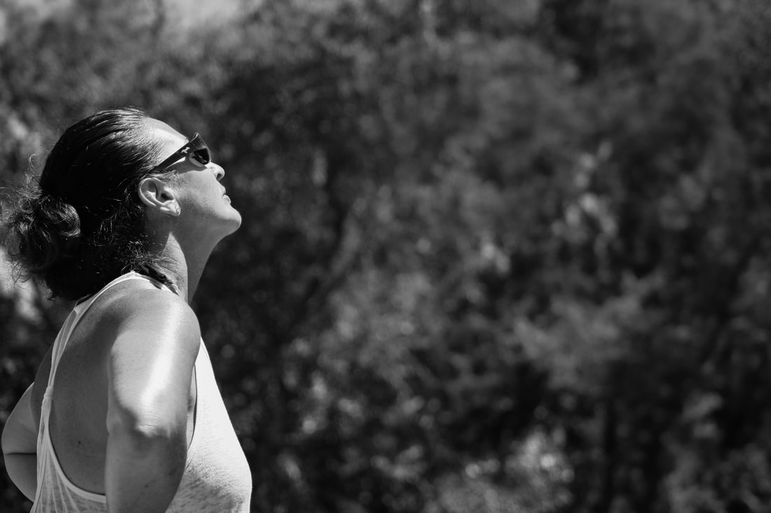 image taken by: Shannon McDermott This is my most successful image because I believe that it fits the category of interpretive very well. The black and white coloring provokes a feeling of emotion from the audience because you focus more on the image and less on the coloring. The blur of the background makes the subject stand out and the lighting highlights the contours of the face and arm. This photo is a successful interpretive image because the audience has no real idea of what the subject is thinking about or why. She could be tired, sad, enjoying the sun - there are endless interpretations of who and why she is posed the way she is. It is truly up the discretion of the viewer to decide who they want the subject to be and what they believe she is feeling. The most challenging aspect of this assignment was trying to take interpretative, ethically evaluative, and theoretical photos. I had ideas of what I wanted to photograph but I just couldn't find the right subjects to provoke the emotions I was trying to exploit. I really enjoy taking portraits that are not posed - I feel that it shows a deeper side of the subject that you can't get when the photo is posed. The pictures I took were my attempt at capturing the natural beauty in the world and the people around me. Though it was a challenge to find the perfect pictures for the subjects, I think that the assignment definitely helped me to understand the kind of photos I have become accustomed to taking and pushed me to step out of my comfort zone. In the future I will definitely try to take photos that produce a deeper emotion from my viewers. I really enjoy taking non-posed portraits of my subjects because I believe that these photos have a lot more to them then meets the eye. There is a significance in the raw emotion that a subject exudes when they aren't told that the photo is being taken. I plan on using this to my advantage in the future and also looking more at that my audience sees when looking at my photos and less of what I have seen. Part IIhttps://mochbrown112.weebly.com/blog/critiquing-photo-challenge This photo was pleasing to the eye at first glance due to the use of complimentary colors in conjunction with the analogous colors. My eyes were immediately drawn to the details in the hands of the subject which then brought my eye to the needle and thread. The contrast due to the frontal light on the hands emphasizes the intricate details in the skin and hands that makes the viewer think that the subject of the photo is the artist doing the work - not the work itself. The angling of the camera and the uncentered orientation provokes a feeling of movement, making this a great interpretive photo. It is up to the discretion of the viewer to wonder who the artist is and why their is a significance in the fox that they are working on. The only thing I may have done differently is edited the photo to have a little bit more contrast which would produce a greater detail in the artist's hands and the needle and thread.
Part I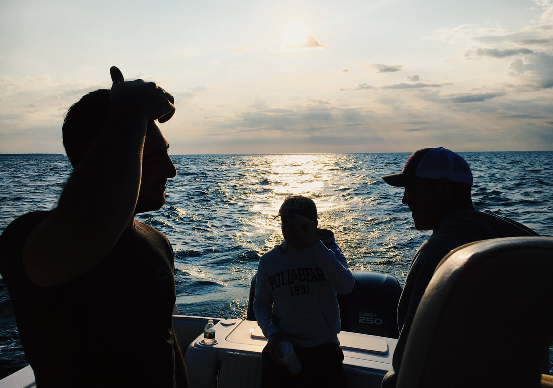 image taken by: Shannon McDermott I felt that this was my most successful image because of the way that the back light produced the silhouettes of my family. It combines the rule of odds, back light, and a deep blue color (symbolizing peace and honesty) to display a clean yet dramatic photograph. The clarity of the ocean in the background combined with the realistic and contrasting silhouettes of my family forged a striking image. This was one of the few photos that I took without my actual camera. My family was out fishing and I just saw the perfect image laid out in front of me so I snapped it on my phone and it ended up being one of my favorite pictures. The most challenging aspect of this assignment was finding the perfect lighting for my photos. I knew the exact images that I wanted in my head, but it was difficult to find the right lighting to go along with the emotion I wanted to draw from viewers. For example, it ended up being luck that I was on the boat during the sunset and had the ability to obtain the image I wanted. When I wanted to photograph any type of hard light it became a challenge because the past week had been mostly cloudy which made great photos for diffused or soft lighting but not so much for back light, side light, frontal light, etc. In the future I am looking forward to combining all of the skills I learned in this past assignment in order to produce more dramatic photos. Towards the end of my assignment, I discovered that when you efficiently combine various compositions, lighting, and colors you can really create a powerful image for your audience. I look forward to combining different symbolic colors in my photos to see if I can feel the emotions that they are meant to display. I also like the powerful impact black and white images produce when taken under the right composition and lighting, so I intend to use this color technique for my future projects as well. Part IIhttps://manlingzhang.weebly.com/blog/june-21st-2019 The first aspect that drew me to this photograph was the angling used. The low perspective makes the cathedral seem prominent and intense, while also allowing the viewer to see the classic ambiance in the details of the stone. The symmetry in the architecture is immediately pleasing to the eye, while the diffused light adds an almost elegant feel to the environment. The background also compliments the subject - the color blue is symbolic of peace, honesty and devotion, all values that can be viewed as religious or holy. The image brings a warm feeling to me because I love architecture and the cathedral as the subject brings an angelic aura to the photo. The only thing I may have done different is centered the photo to an even angle and then cropped the picture so the symmetry is more prominent. By making each side even, you would make your image even more successful then it already is.
|


 RSS Feed
